Adidas Sales Analysis (2020 - 2021)
Project Overview:
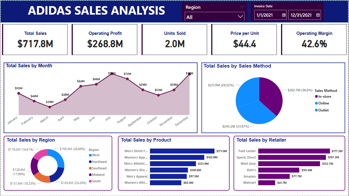
This project focuses on analyzing and visualizing Adidas sales data for the years 2020 and 2021 using Microsoft Power BI. The dataset contained approximately 10,000 rows of pre-cleaned and transformed Excel data. The goal was to derive insights into sales performance across different regions, product categories, and time periods while enhancing my Power BI skills.
Objective:
- To develop an interactive Power BI dashboard that presents key sales insights.
- To identify sales trends across different time periods.
- To gain hands-on experience with Power BI's visualization capabilities.
Data Overview:
- Source: Excel dataset (pre-cleaned and transformed)
- Number of Rows: ~10,000
- Time Period: 2020 - 2021
- Key Fields: Product Category, Region, Sales Amount, Date, Quantity Sold, Revenue
Key Visualizations & Insights:
- Sales and Trends: Area Chart was used to display monthly sales and a pie chart to display sales by method.
- Top-Selling Products: A bar chart was used to display the best-selling product categories.
- Regional Breakdown: A donut chart provided a breakdown of revenue across different regions.
Challenges and Learnings
- Since this was my first Power BI project, I focused primarily on data visualization without incorporating DAX expressions or additional data transformations.
- I gained a strong foundational understanding of Power BI’s interface and visualization tools.
- The project helped me recognize the potential of DAX for deeper analysis, which I plan to incorporate in future projects.
Next Steps for Improvement:
- Implement DAX measures for advanced calculations such as running totals, YoY comparisons, and profitability metrics.
- Explore data transformation techniques within Power BI to enhance data preparation.
- Work on more complex datasets to further develop my analytical skills.
This project marks my entry into Power BI and serves as a stepping stone for more advanced analytics and business intelligence projects in the future.